
A Cloud Platform for Geologists
DeepGeo is a cloud platform that helps geologists and geotechnical engineers collect, store, and analyze field data in one place.
For the product launch, the team needed a clear and memorable identity that would bring consistency across design, development, and sales.
Our brief:

We studied the visual language of geology: drill cores, rigs, soil layers, cross-sections, map markers. Dozens of sketches came out of this research, and the process was highly collaborative. The client joined design calls, gave feedback on rough drafts, and even discussed hand sketches.
From there, we shaped three main directions:

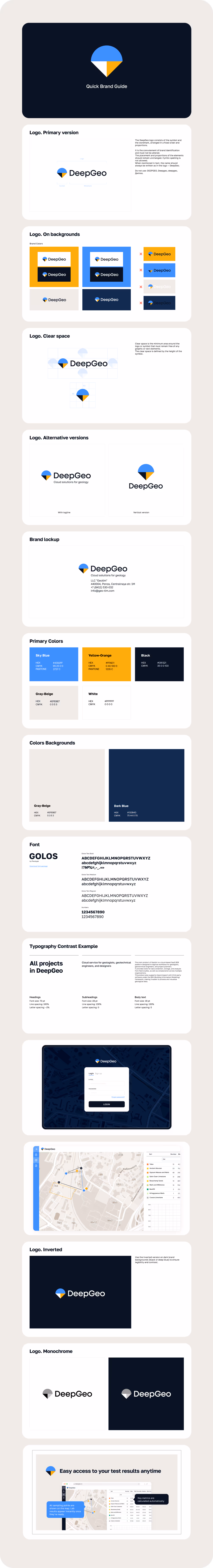
The final symbol merges all three. A geometric «core» slice forms a pointer, with colors layered like soil.
It’s simple, distinctive, and easy to reproduce. We tested it in small sizes, on light and dark backgrounds, and across digital and print. The mark held its clarity everywhere, giving confidence it would scale with the product.

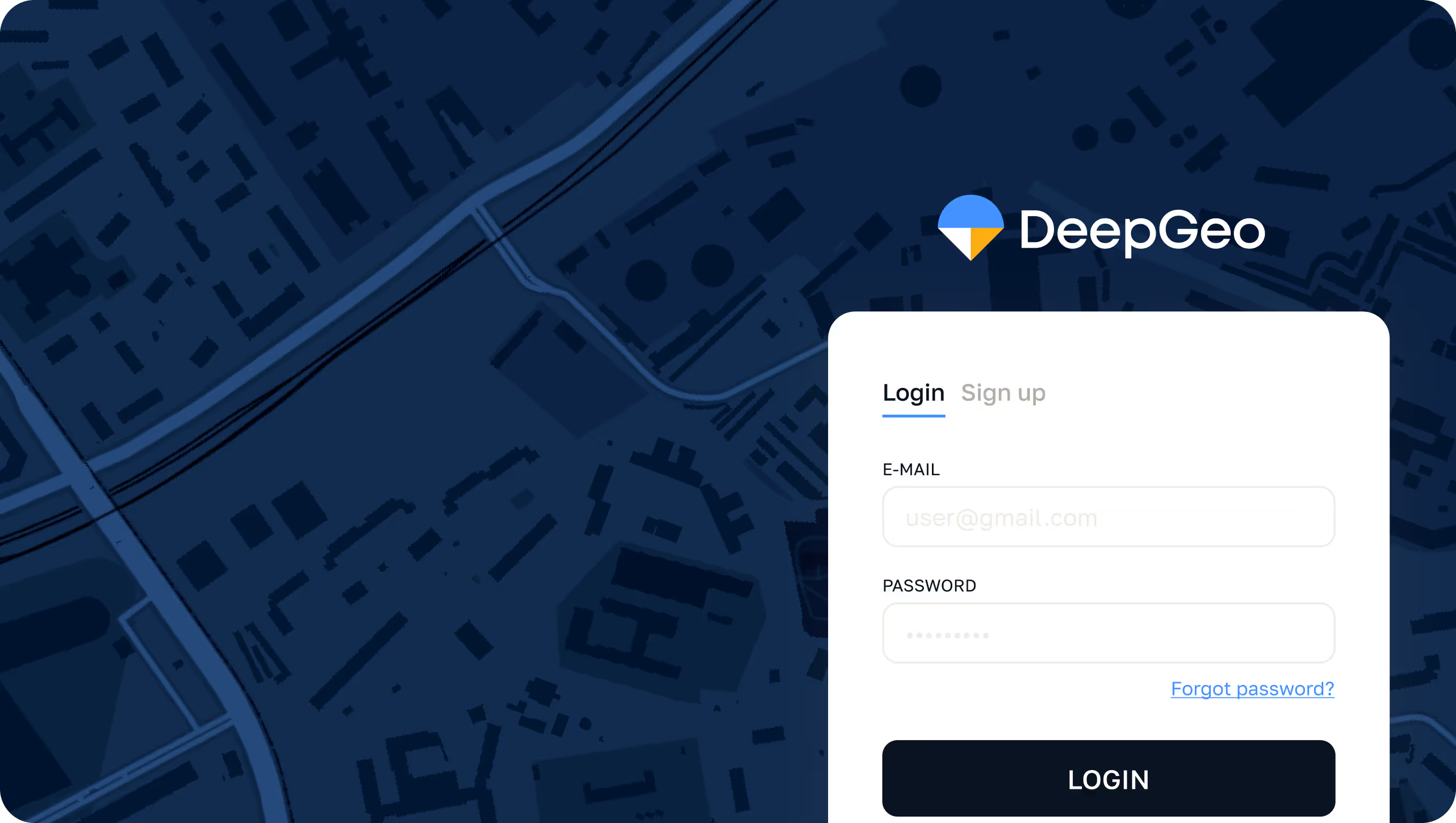
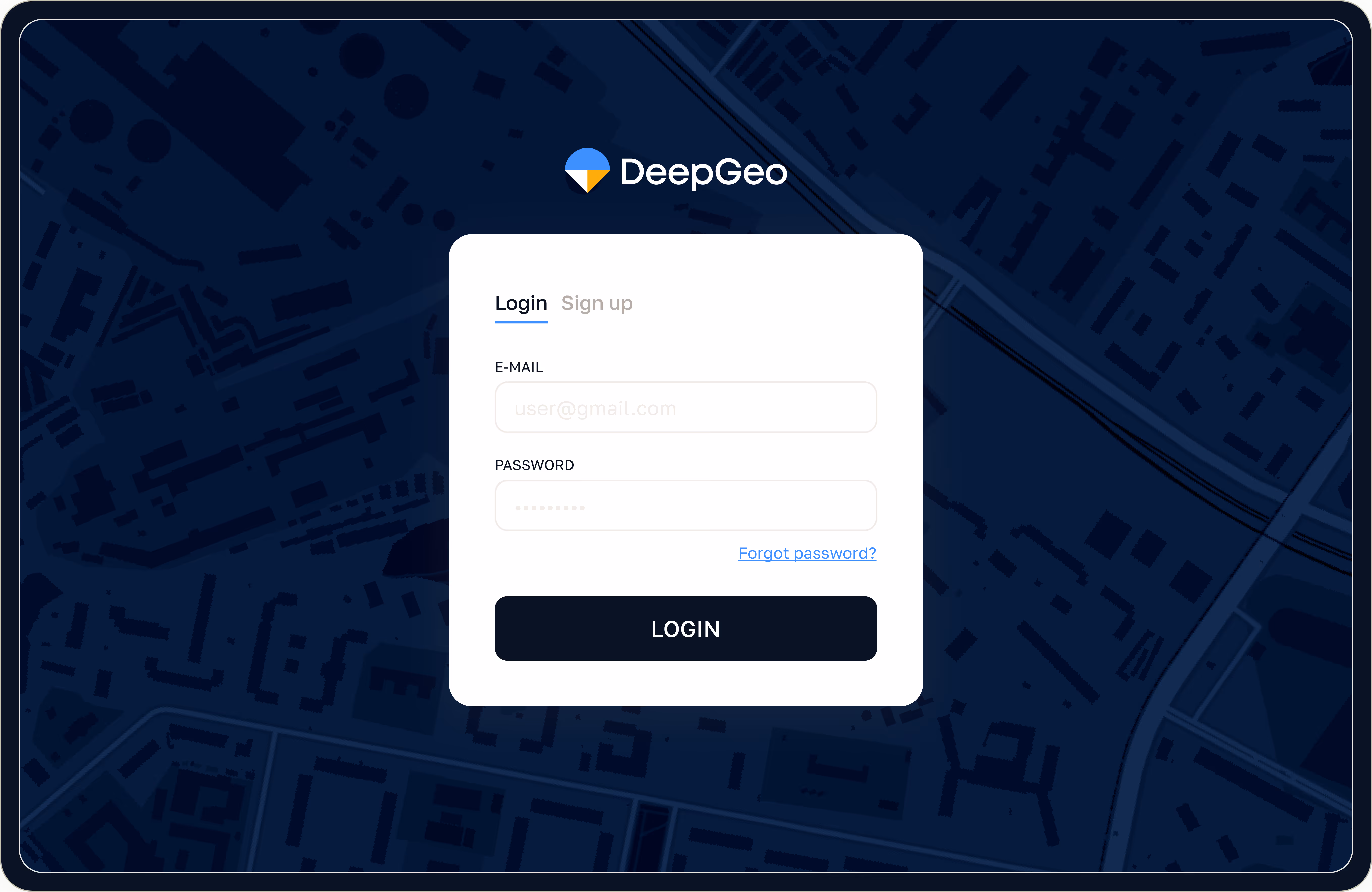
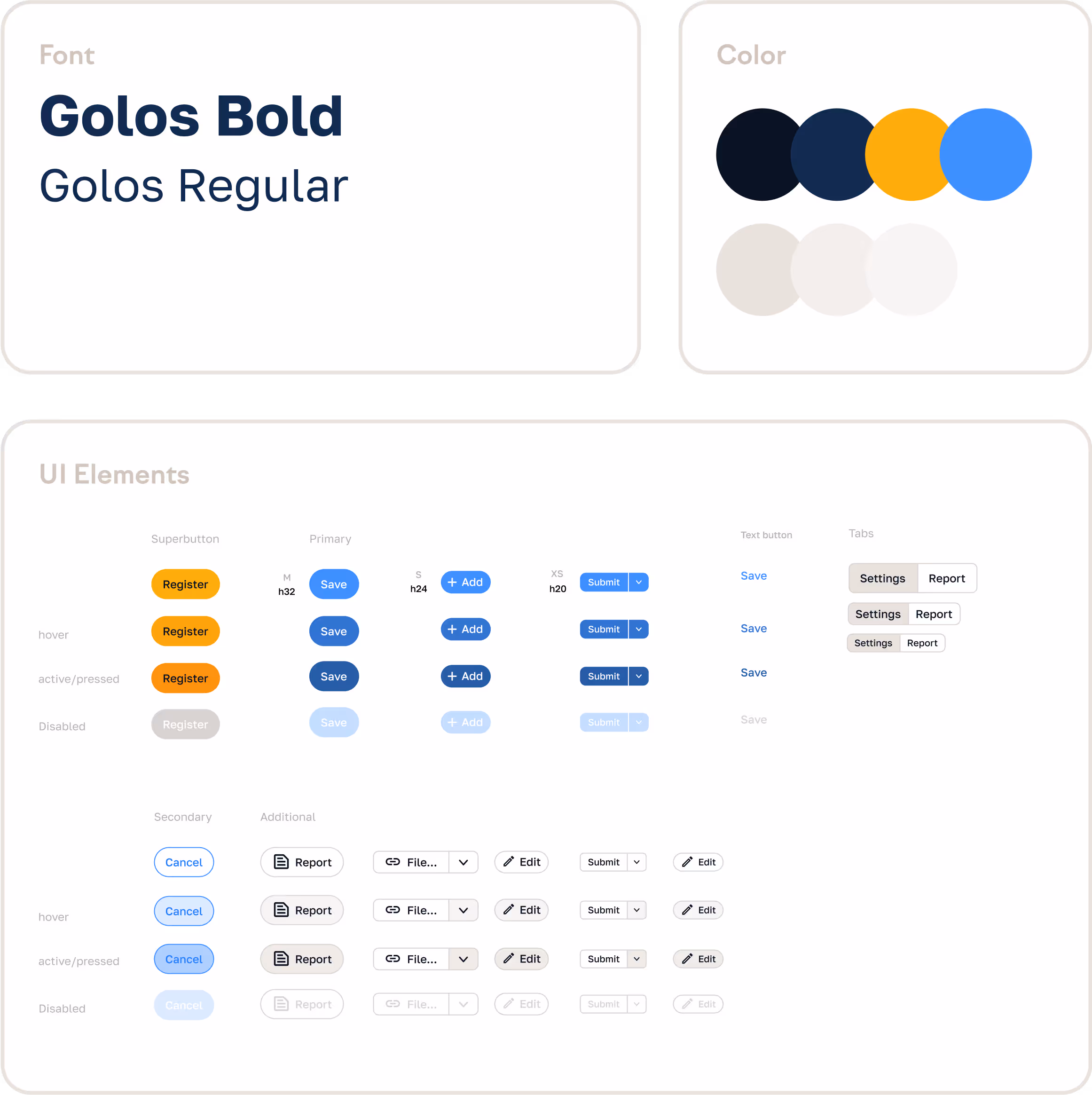
One of the main challenges was implementation. The product ran on a rigid framework that only allowed styling through tokens, with no direct CSS access. Our solution was a lightweight CSS overlay.
It redefined key variables and added missing styles while keeping the framework intact. This gave the product a branded, consistent interface without risking future updates.


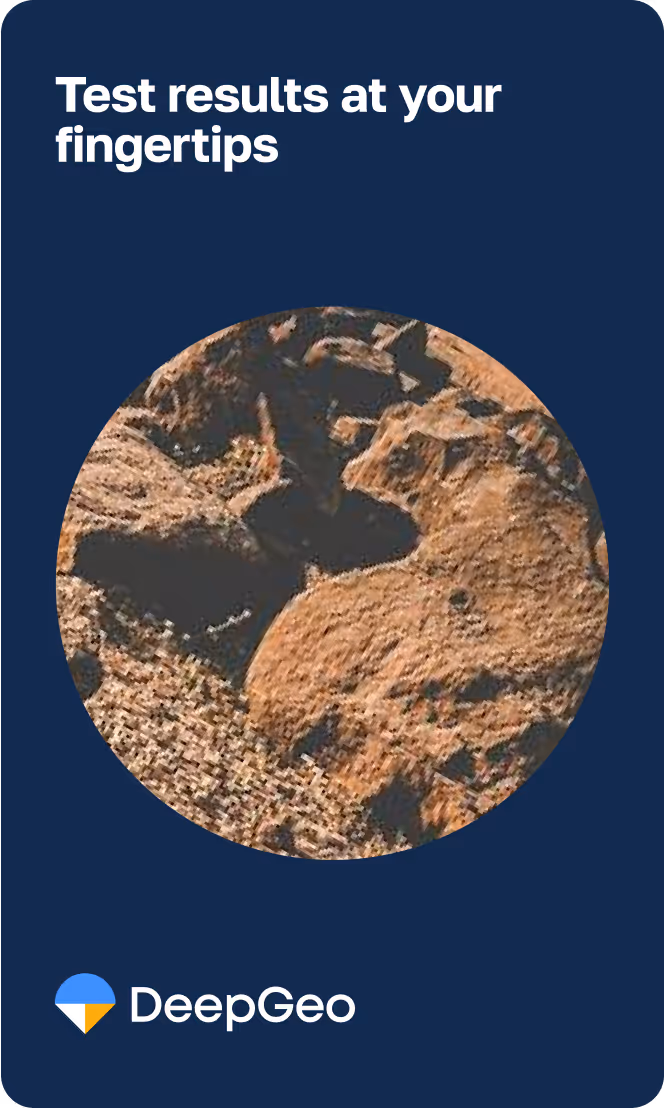
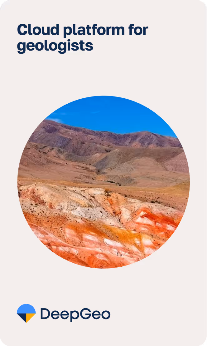
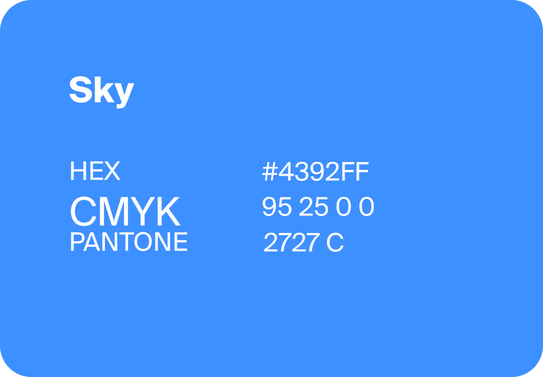
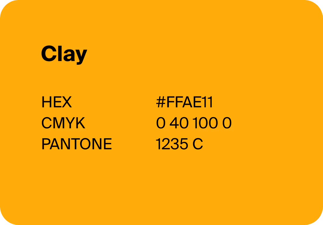
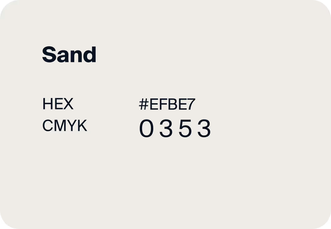
The palette is built on contrast: sky, sand, clay, obsidian. These tones reference geological landscapes, while also working across contexts. In the product, they highlight interface states and backgrounds. In marketing, they add strength and clarity to presentations and landing pages.

We selected Golos Text in three weights — Regular, Medium, and Bold — because it adapts well to different situations. It remains crisp and functional in UI, but adds presence in presentations. The typeface scales smoothly, keeping the same voice across all formats.
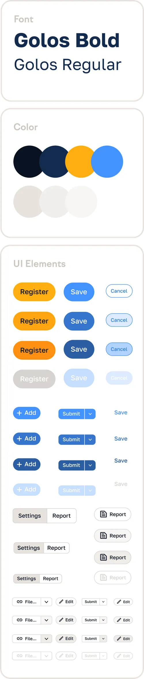
We wrapped the essentials into a short but practical guide. Logo, colors, and type rules are clearly documented, making it easy for the team to keep the style consistent without unnecessary overhead. The guide saves time when building new screens and ensures the identity works in both product and communications.

The process was highly collaborative: from early calls to final approval, the client was involved in every stage. This ensured the identity felt natural both in the product and in external communication.
If this approach resonates with you, let’s see what we can create together.

